Ensuring your eCommerce website sells is about more than just offering your target audience high-quality products at great prices. Much more than that, it’s about using different digital marketing strategies to convince web visitors to convert. And, of course, it’s about knowing how to utilize web design to its maximum capacity.
Although aesthetics may not seem relevant, they’re hugely important when boosting eCommerce conversions. Research suggests that web design directly impacts consumers’ willingness to trust a business. And even more, it influences people’s readiness to invest in solutions.
With this in mind, it’s evident that paying attention to eCommerce web design pays off. Even more, optimizing product pages — where sales happen — can positively impact your brand’s success and its capability of converting new clients.
So, without further ado, here are the eCommerce product page design best practices you must adhere to on your website.
Show off Branding Elements
One of the most effective ways to elevate eCommerce product pages is by showing off relevant branding elements in the right spots.
Consumers often decide what products to invest in based on the brands behind those products.
Research data from 2018 shows that 82% of people choose a familiar brand for the first click when browsing SERPs for product results. Moreover, 71% of consumers are more likely to buy a product from a recognizable brand.
This data doesn’t just highlight the importance of developing and implementing an effective digital marketing strategy for your brand. It also shows that your audience must see relevant branding elements on your product pages. Even if only to remind them that they know and trust your business.
Of course, you don’t have to go overboard. You can still get away with subtlety. But, you must ensure your brand’s logo is visible at the top of the page. If you’re having trouble coming up with a logo for your brand, consider using an AI logo generator to help you. Moreover, consider choosing a primary product photo that shows off a branding element.
Check out the Burberry Long Kensington Heritage Trench product page. It features an attention-grabbing brand logo at the top of the page. Furthermore, the first product photo gives a sneak peek at the garment label and the brand’s recognizable checkered color palette used for the coat lining.
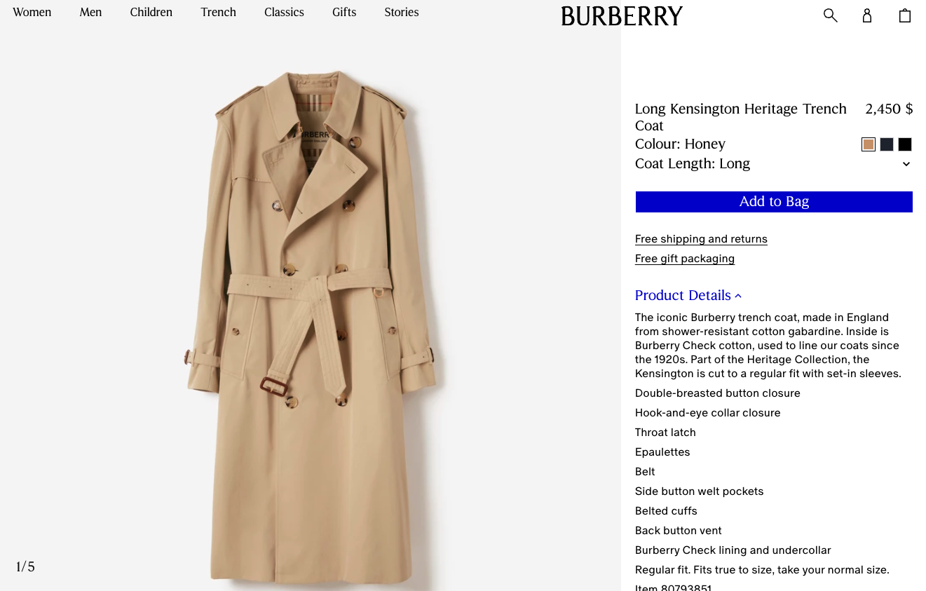
Source: burberry.com
Display Relevant Trust Badges
In eCommerce, you need more than just web visitors to recognize your brand to boost sales. Yes, it can help. However, today’s buyers need more proof of quality and reliability to spend their hard-earned money.
According to Adobe, consumers who trust a brand are more likely to convert (7 out of 10 people buy more from the brands they trust). Additionally, earning your audience’s confidence helps improve reach, boost customer loyalty, and generate positive reviews.
With this in mind, it’s clear that your product pages must prioritize credibility-boosting design elements. And in addition to product ratings and reviews, trust badges are some of the most effective components of web design you can use. Consider collaborating with a skilled webflow web design team to seamlessly integrate these trust-building elements into your site, enhancing user trust and satisfaction.
For example, if you check out this supplement for vegans page on the Transparent Labs website, you’ll notice several credibility-supporting badges.
Firstly, there are the “no artificial sweeteners,” “no artificial coloring,” and “gluten-free and non-GMO” signs in the product overview section. Then Transparent Labs adds more trust-building badges to the bottom of the page to prove that its products are science-backed and 3rd-party lab-tested. Those pieces of information are particularly important in the supplement industry.
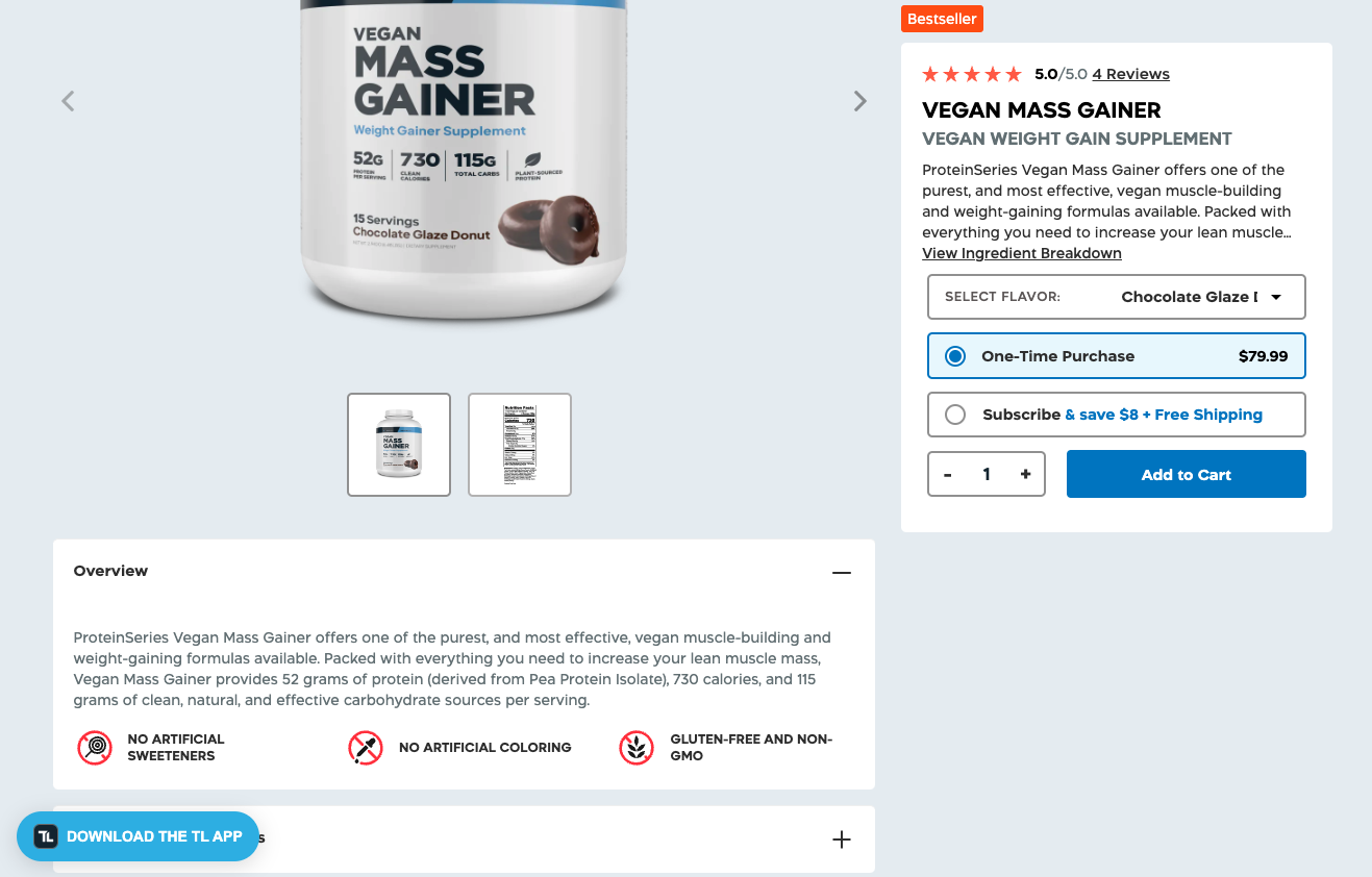
Source: transparentlabs.com
Boost Social Proof with UGC
Another exceptional way to nurture trust on your eCommerce product pages is to enhance them with social proof. Even just showing off reviews from existing customers can be enough to convince on-the-fence consumers to convert.
However, to maximize sales, explore ways to prove that the social proof on your website is authentic.
If you look at the research on the most authentic formats brands can use, you’ll find that user-generated content tops most charts.
Unfiltered user-submitted feedback is an excellent way to testify to the quality of your solutions. But more importantly, these testimonials often come in different formats, giving potential buyers a better insight into what they can expect from your business.
The best part of employing UGC on your product pages is that it doesn’t have to be a complex design fix. You could source images or videos from social media or collaborate with content creators. However, even something as simple as allowing reviewers to upload images — as done by Mannequin Mall on its Female Professional Dress Form page — will be enough to take your social proof to the next level.
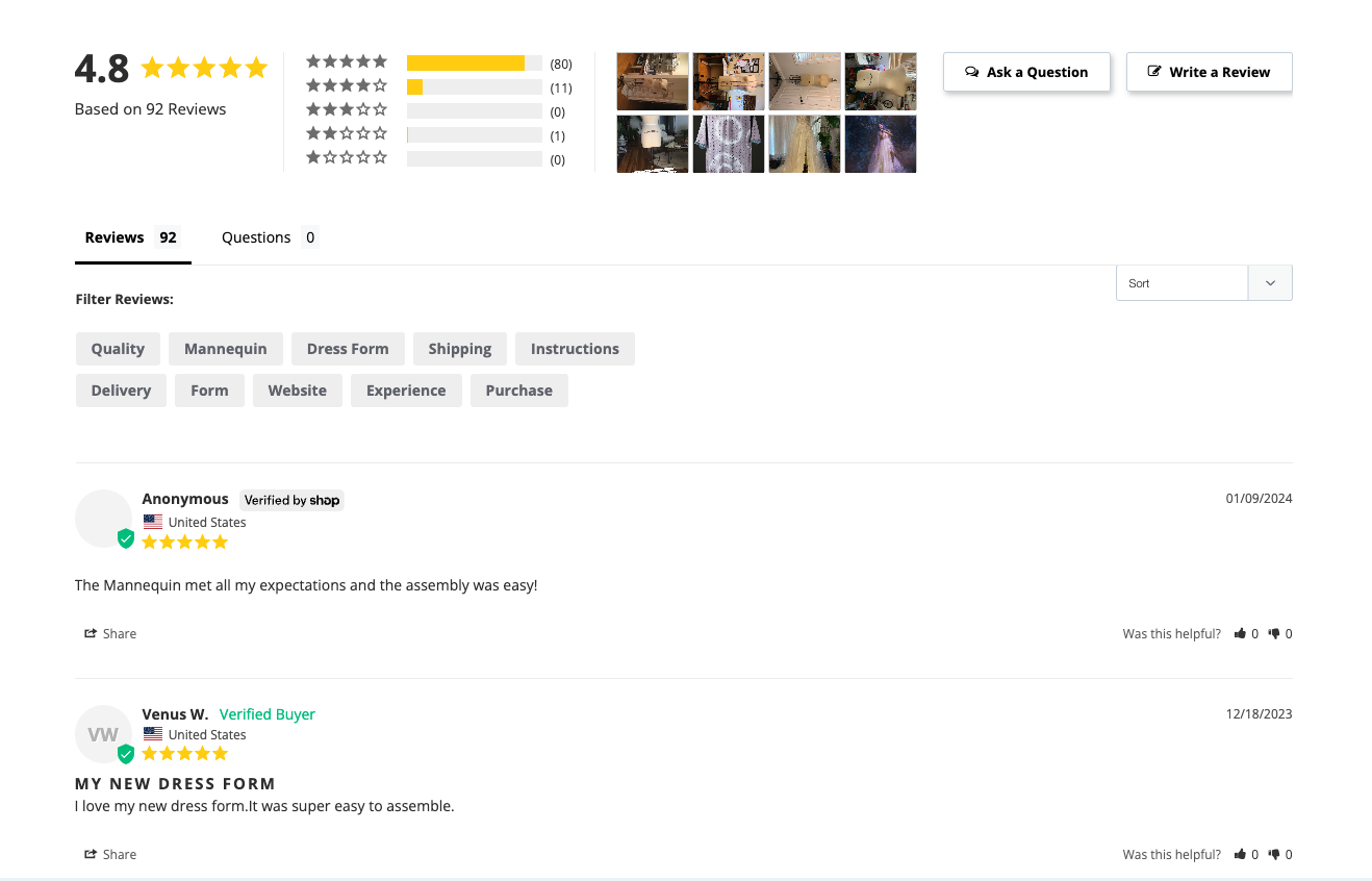
Source: mannequinmall.com
Make Use of Explainer Videos
The best way to encourage conversions is to ensure your audience understands the unique value your solutions offer.
And what better way to communicate that value than to use explainer videos?
If you’re not convinced that investing in this format for your site (and digital marketing strategies) is worth the effort, consider these findings from Wyzowl:
- 91% of people have watched an explainer video to learn more about a product or service.
- 82% of people have been convinced to buy a product by watching an explainer video.
- When asked how they prefer to learn about a solution, 44% of people said they want to watch a video (compared to 16% who want to learn from manuals, 15% who prefer infographics, and 13% whose favorite way of learning is to read a text-based article).
In other words, if you want to follow eCommerce product page design best practices, you must invest in an explainer video. And even more importantly, you must show off this element in a highly visible spot where it’s guaranteed to capture web visitors’ attention.
For a great example, check out Vivion. In addition to using text to explain what its Citric Acid ingredient does (and how it can be applied), the brand also uses video. Why? Well, because watching a 3-minute video is far more convenient than reading through a large amount of text and technical information.
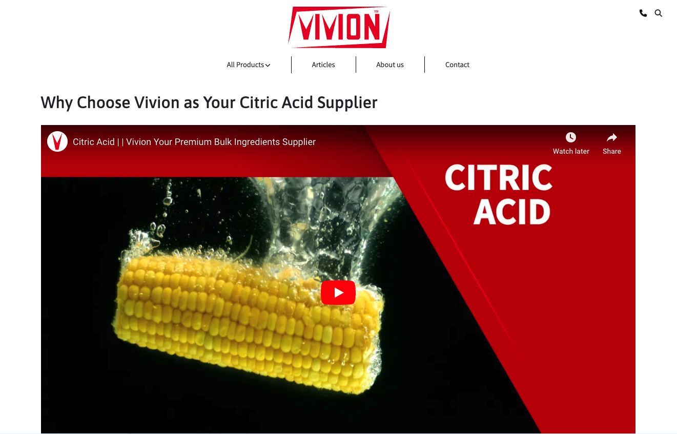
Source: vivion.com
Offer a Diverse Image Gallery
If you look at the research about how consumers make purchasing decisions, you’ll discover that product photography has a huge impact on convincing your prospects to convert. Data shows that 75% of online shoppers decide whether to invest in an item based on product photos.
So, to guarantee your eCommerce product pages drive sales, take your image gallery to the next level.
Of course, the easiest way to use product photos for their conversion-improving potential is to pay attention to quality. Scientific data shows that warm, high-contrast photos with a large key object and social presence appeal most to users.
Nonetheless, remember that in eCommerce, your audience lacks a crucial manner of evaluating products — touch. So, to make up for that drawback, it’s essential to give them as many images as you can so that they can assess whether your solutions are the right choice for them.
For example, if you check out the VOODOO Black Aluminum Wheels product page on the Golf Cart Tire Supply website, you’ll see it features a rich photo gallery. Each product photo is high-quality, and the brand shows off the solution from multiple angles. Components are displayed individually. There are even pictures of the wheels on a real-life golf cart, helping potential buyers imagine how they will look on their vehicles.
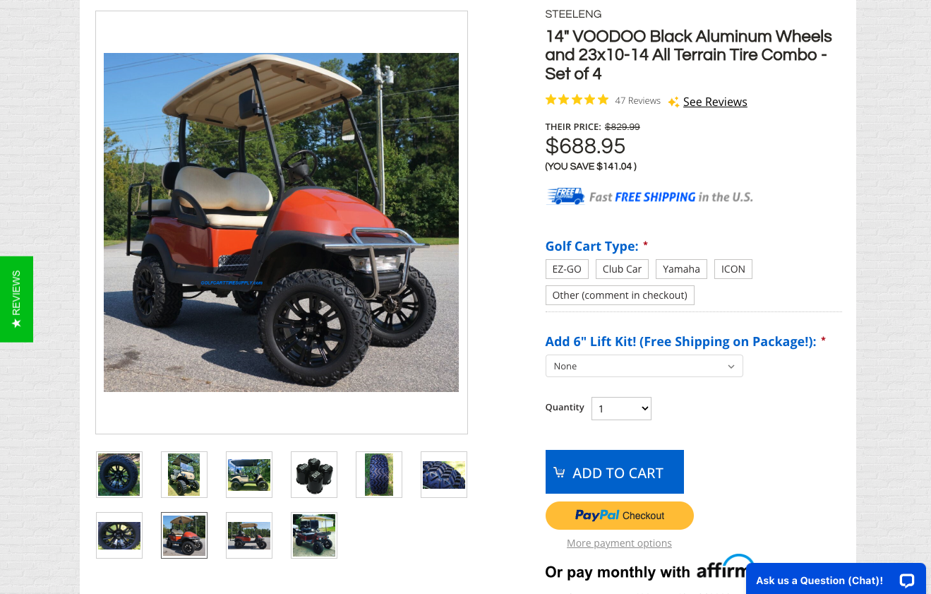
Source: golfcarttiresupply.com
Funnel Email Subscribers to Product Pages
Sometimes, the best way to ensure your product pages sell isn’t to adjust the design. Instead, you must guarantee that the visitors landing on these pages genuinely want to be there.
That is, sending anyone to a product page — whether they want to be there or not — won’t boost conversions. On the contrary, it will result in high website bounce rates, which could seriously harm your SEO.
However, if you generate organic web traffic in a way that results in longer page dwell times, you won’t just increase your chances of selling. More importantly, you’ll boost your eCommerce site’s chances of earning a high SERP ranking.
One excellent strategy to ensure that your product pages receive a lot of intentional, high-quality traffic is to funnel email subscribers to your product pages. This works because your newsletter subscribers already know your brand (and probably trust you). It also helps speed up the conversion process. Do your best to optimize email campaigns in a way that draws subscribers’ attention to specific products.
For even better results, allow people to visit product pages by clicking on a link in their emails. This will benefit your business and make acquiring products easier for your customers, resulting in a more positive CX and increasing their chances of continuing to buy from your brand.
Include User-Oriented Tools
As you explore eCommerce product page design best practices, remember that the best way to appeal to your audience (and convince them to convert) is to provide them with the information and tools they need to make the best possible buying decision.
In today’s world, this can be as easy as knowing what your potential customers need from your brand.
For example, knowing the importance of a good fit, fashion brands like Arc’teryx regularly add detailed size charts, fit guides, and layering advice to their product pages.
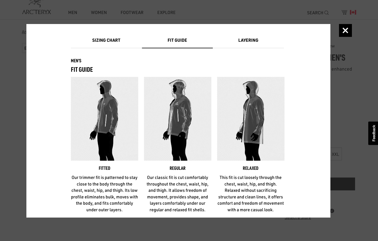
Source: arcteryx.com
Or, if you look at some of the latest consumer insights, you’ll find that many people want brands to provide subscription options. Ultimately, these features are convenient and they allow buyers to save some money. Plus, they help brands encourage loyalty.
So, why not add a subscription option to your website, like the one on Athena Club’s Creamy Body Wash page?
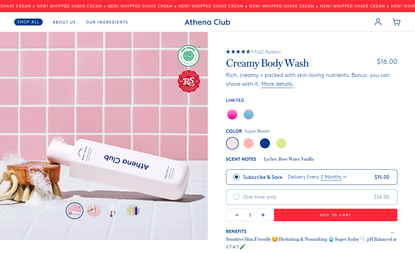
Source: athenaclub.com
Or, perhaps you could use your experience and expertise to make UX improvements to your product pages. For example, some products could deliver a better customer experience when paired with different solutions from your offer. So, why not call your audience’s attention to this fact with cross-selling features?
If you look at this lipstick product page on the Chanel website, you’ll see one of the best examples of cross-selling. Knowing that a rouge isn’t enough to create an entire make-up look, the brand’s web design team decided to call shoppers’ attention to the other tools they might need to complete their look — including a matching lip pencil, an eyeliner, and a mascara.
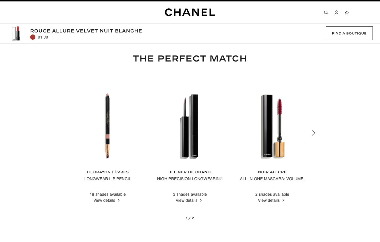
Source: chanel.com
Show Delivery Information to Prevent Cart Abandonment
Finally, as you explore product page design best practices for your eCommerce website, remember that convincing your audience to add an item to their carts isn’t enough. To see real results, you must also convince them to go through with their purchase.
So, if you want to guarantee the highest possible conversion rate on your site, do your best to make design choices that will prevent high cart abandonment rates.
For instance, data shows that 48% of people don’t finish a purchase due to high extra costs. So why not do your best to display these before prospects reach your Cart page? Or, consider that 26% of people don’t want to create an account to buy. Fortunately, this shouldn’t be a big conversion obstacle. All you need to do to overcome it is enable one-click checkout on your product pages, as done by Carhartt with the PayPal checkout button on its T-shirt product pages.
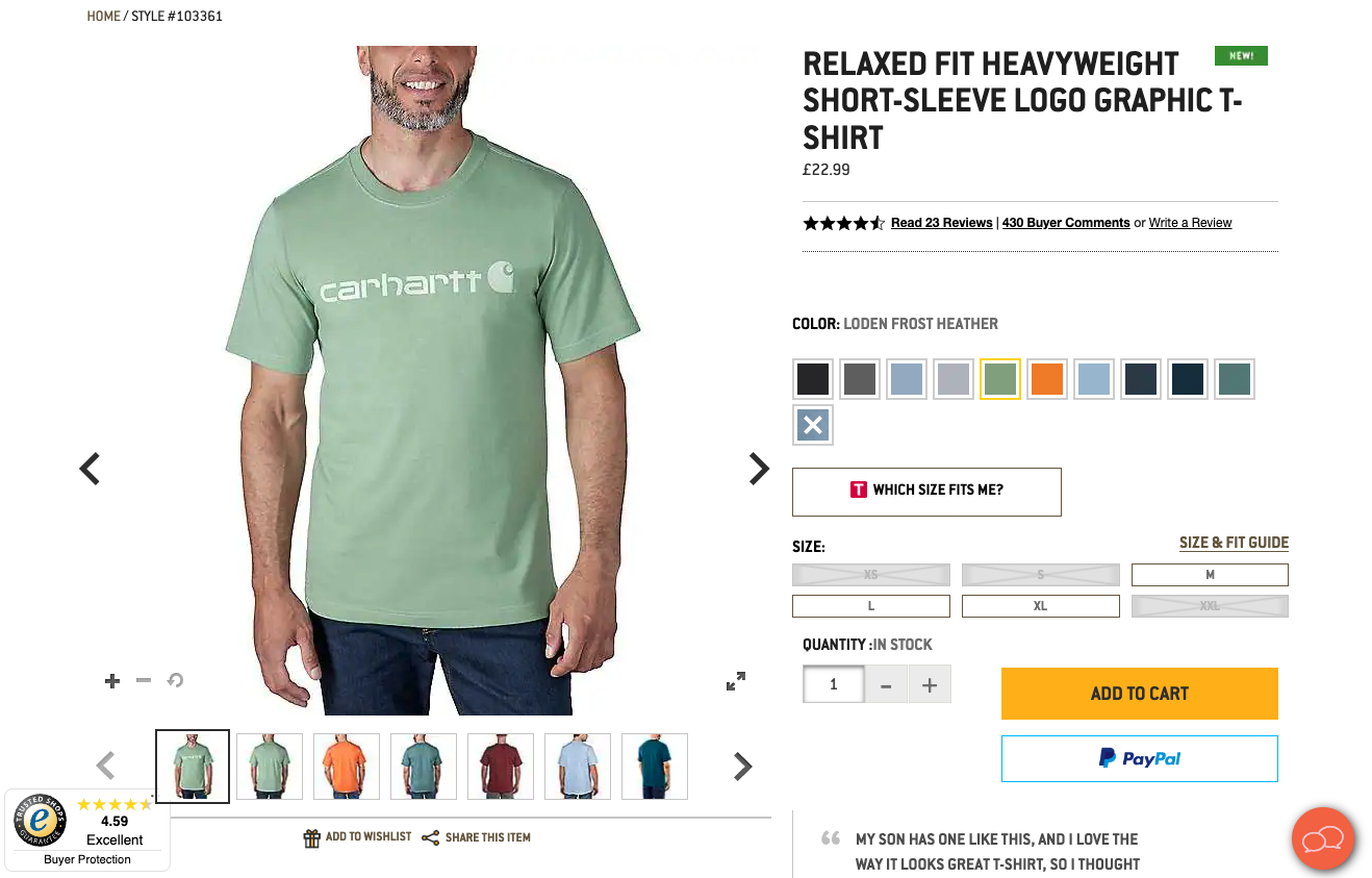
Source: carhartt.com
Final Thoughts
Although there’s a lot you can do to enhance the sales potential of your eCommerce product pages, there’s one thing you must remember. In addition to adhering to design best practices, keep your target audience’s specific needs and preferences in mind to ensure the highest possible conversion rate.
Furthermore, try to make design decisions based on real-life data whenever possible. Something as simple as A/B testing could help you identify the best design option for your brand. Plus, it might reveal additional data you can use to optimize your website and even open your eyes to new customer info that could help you improve your email campaigns.